
html旋转代码_用CSS实现一个抽奖转盘(附详细代码+思路)
日期: 2020-12-01 分类: 个人收藏 680次阅读

原文:https://www.cnblogs.com/wenruo/p/9732704.html
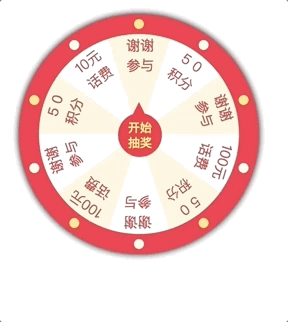
先上效果
基本是用CSS实现的,没有用图片,加一丢丢JS。不过没有考虑太多兼容性。
首先画一个转盘
<html lang="en"><head> <meta charset="UTF-8"> <title>幸运大转盘title> <style> /* 重置默认样式 */ * { margin: 0; padding: 0; border: none; outline: none; } .wrapper { position: relative; height: 200px; width: 200px; padding: 20px; margin: 20px; background-color: #c0381f; box-shadow: #000000 0px 0px 10px; border-radius: 50%; } .panel { position: relative; height: 200px; width: 200px; background-color: #b7b7b7; border-radius: 100px; } .pointer { position: absolute; left: 79px; top: 79px; z-index: 10; height: 30px; width: 30px; padding: 6px; color: #fff899; line-height: 15px; font-size: 12px; text-align: center; background-color: #dc5b5b; border-radius: 50%; border: 1px solid #c0381f; }style>head><body> <div class="wrapper"> <div class="panel"> <div class="pointer">开始抽奖div> div> div>body>html>效果如下,配色什么的不要在意,可能比较丑。。。

然后写抽奖指针的小箭头,用CSS画三角形是一个比较常见的问题,通过设置width和height为0,然后用border实现。

如图,矩形是由四个三角形边框组成的,只要设置其它边颜色为透明,就可以获得单独的三角形。
这里通过伪元素after实现三角形,并通过绝对定位将三角形定位到中间小圆的顶端。
.pointer::after { content: ''; position: absolute; left: 14px; top: -24px; border-width: 12px 6px; border-style: solid; border-color: transparent; border-bottom-color: #c0381f;}现在才像一个指针了。

哦 接下来是实现转盘背景,不同的扇区对应不同的奖品,这样就有一个需求:实现任意角度扇形。
可能会想当然的认为和三角形一样,不过是加一个border-radius而已,高度是圆半径,宽度是tan(θ/2),但是实现出来的效果和想象并不一样……(可能需要做一些其他操作以达到效果,但是我没想到。
最后还是求助了搜索引擎。不得不承认dalao们实在是太nb了,qaq……通过 linear-gradient 实现想法是真的棒。不过还有好多复杂的实现看的不是很懂= =
How to draw a circle sector in CSS?
Segments in a circle using CSS3
3种纯CSS实现中间镂空的12色彩虹渐变圆环方法
实现就是通过两个正方形取相交区域。

我觉图画的还是挺好的:D
没有用伪元素实现,因为我还要加文字,至于文字的位置,我真的是瞎调的,反正正经写代码也不会这么写= =
<html lang="en"><head> <meta charset="UTF-8"> <title>Documenttitle> <style> .sector { position: absolute; width: 100px; height: 200px; margin: 100px; border-radius: 0px 100px 100px 0; overflow: hidden; transform: rotate(-18deg); } .sector-inner { text-align: center; display: block; width: 40px; padding: 5px 3px 0 57px; height: 195px; background: #ffeab1; transform: translateX(-100px) rotate(36deg); transform-origin: right center; border-radius: 100px 0 0 100px; } .sector-inner span { display: block; transform-origin: center; transform: rotate(-19deg); color: #d46854; }style>head><body> <div class="sector"> <div class="sector-inner"> <span>谢谢参与span> div> div>body>html>效果如下,一个带有文字的小扇形~~
OK,现在写一堆扇形放到一开始的转盘上。
现在的代码是酱紫滴~~太长了折起来。
 View Code
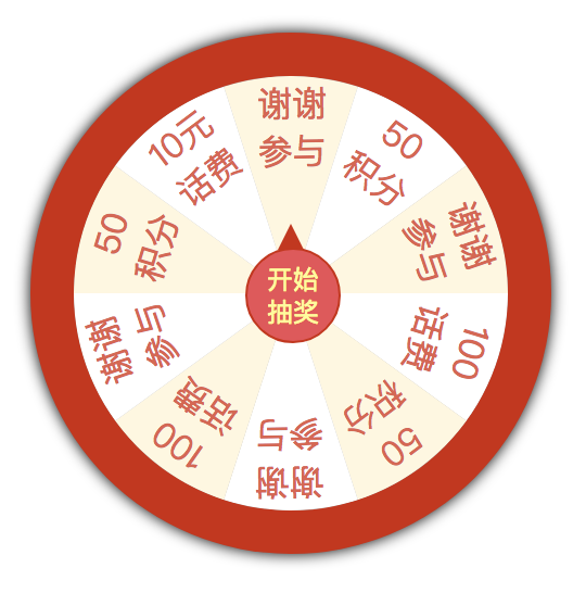
嘻嘻,现在是抽奖转盘的样子了吧~~~
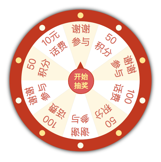
最后再加点浮夸的灯。
View Code
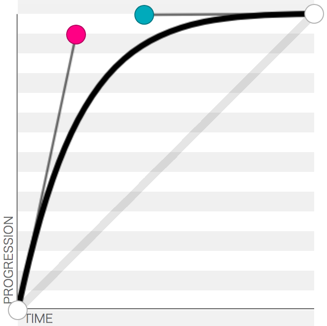
现在转盘CSS部分基本完成。简单写一下JS部分。点击中间的指针时,指针会转,可以拉一条贝塞尔曲线,控制动画的速度。
贝塞尔曲线可以简单的看作是时间-距离曲线,斜率就是速度。因为转盘的速度肯定是先快后慢,随便拉一条。
http://cubic-bezier.com/#.2,.93,.43,1
CSS中添加属性
.pointer { // ... transition: transform 3s cubic-bezier(.2,.93,.43,1);}点击开始抽奖的时候,为中间的指针加一个旋转的角度。这里有一个问题就是不同的扇区抽到的概率是相同的,改成不同应该…也蛮简单的,不过主要是想练下CSS,JS就随便写了。
JS部分代码。。
let getEle = document.getElementsByClassName.bind(document);let pointer = getEle('pointer')[0];let result = getEle('result')[0];let onRotation = false; // 记录当前是否正在旋转,如果正在旋转,就不能继续点击了let reward = ['谢谢参与', '50积分', '谢谢参与', '100元话费', '50积分', '谢谢参与', '100元话费', '谢谢参与', '50积分', '10元话费'];// 根据随机角度获取奖励let getReward = (function() { currentDeg = 0; return function() { // 转三圈到四圈 let rotateDeg = Math.random() * 360 + 1080; currentDeg += rotateDeg; let rewardText = reward[Math.floor((currentDeg + 18) % 360 / 36)] return { deg: currentDeg, text: rewardText === '谢谢参与' ? '很遗憾,您没有获得奖品。' : '恭喜获得: ' + rewardText } }})();pointer.addEventListener('click', () => { if (onRotation) return; console.log('开始抽奖'); onRotation = true; let nextStatus = getReward(); console.log(nextStatus) result.innerText = nextStatus.text; result.style.display = 'none'; pointer.style.transform = `rotateZ(${nextStatus.deg}deg)`;})pointer.addEventListener('transitionend', () => { console.log('抽奖结束'); onRotation = false; result.style.display = 'block';})现在一个抽奖转盘基本完成了,最后一个需求,如果旁边的等能够亮起来就好了。至于灯怎么亮,就需要用到CSS3的动画了,我还不太熟悉,先去学习一下>_<
我学完回来了,参考教程http://www.ruanyifeng.com/blog/2014/02/css_transition_and_animation.html,内容不是很多。
animation-name 指定动画名称,
animation-duration 指定动画持续时间,
animation-timing-function 指定动画函数,和transition的函数是一样的,
animation-delay 指定动画延迟多久后执行,
animation-iteration-count 指定动画执行多少次,默认为一次,可以指定为infinite,无限循环。
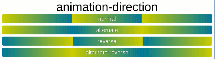
animation-direction 指定动画多次播放时,一次结束,下一次怎么接上一次,如图。
animation-fill-mode 指定动画结束后停在什么位置,默认回到起始状态,forwards表示让动画停留在结束状态,backwards让动画回到第一帧的状态,both根据animation-direction轮流应用forwards和backwards规则。
animation-play-state 动画执行状态,默认为running,可以设置为pause,动画将在当前状态停止,再改为running时,会接着上一次停止的位置继续执行动画。
使用关键字 keyframes 来定义一个动画。通过百分比指定其中任意几个状态。
尝试着写一下=。=
<html lang="en"><head> <meta charset="UTF-8"> <title>Documenttitle> <style> div { height: 30px; width: 30px; animation: 1s twinkling 3, 100ms 3s twinkling 3; } @keyframes twinkling { 50% { background: red; } }style>head><body> <div>div>body>html>这是一个方块,先慢速闪三下,再快速闪三下,最后消失。animation: 1s twinkling 3;
就相当于
animation-name: twinkling;
animation-duration: 1s;
animation-timing-function: ease;
animation-delay: 0s;
animation-iteration-count: 3;
animation-direction: normal;
animation-fill-mode: none;
animation-play-state: running;
效果

我觉得还可以:P 反正我只能写成这样了。
最后把动画加到转盘的灯上。完成代码(好像颜色变了,咳,那是因为我animation学了太久都掉色了):
<html lang="en"><head> <meta charset="UTF-8"> <title>幸运大转盘title> <style> * { /* 重置默认样式 */ margin: 0; padding: 0; border: none; outline: none; user-select: none; } .wrapper { position: relative; height: 200px; width: 200px; padding: 20px; margin: 20px; background-color: #ff5555; box-shadow: #000000 0px 0px 10px; border-radius: 50%; } .light { position: absolute; height: 10px; width: 10px; border-radius: 50%; top: 5px; left: 115px; transform-origin: 5px 115px; } .light-twinkling { animation: 1s twinkling 3, 100ms 3s twinkling 3; } .light:nth-child(2n) { background-color: #fafce7; } .light:nth-child(2n+1) { background-color: #ffe58b; } .light:nth-child(2) { transform: rotate(36deg); } .light:nth-child(3) { transform: rotate(72deg); } .light:nth-child(4) { transform: rotate(108deg); } .light:nth-child(5) { transform: rotate(144deg); } .light:nth-child(6) { transform: rotate(180deg); } .light:nth-child(7) { transform: rotate(216deg); } .light:nth-child(8) { transform: rotate(252deg); } .light:nth-child(9) { transform: rotate(288deg); } .light:nth-child(10) { transform: rotate(324deg); } .panel { position: relative; height: 200px; width: 200px; background-color: #b7b7b7; border-radius: 100px; } .sector { position: absolute; left: 100px; top: 0px; width: 100px; height: 200px; font-size: 14px; border-radius: 0px 100px 100px 0; overflow: hidden; transform-origin: left center; } .sector:nth-child(1) { transform: rotate(-18deg); } .sector:nth-child(2) { transform: rotate(18deg); } .sector:nth-child(3) { transform: rotate(54deg); } .sector:nth-child(4) { transform: rotate(90deg); } .sector:nth-child(5) { transform: rotate(126deg); } .sector:nth-child(6) { transform: rotate(162deg); } .sector:nth-child(7) { transform: rotate(198deg); } .sector:nth-child(8) { transform: rotate(234deg); } .sector:nth-child(9) { transform: rotate(270deg); } .sector:nth-child(10) { transform: rotate(306deg); } .sector:nth-child(2n+1) .sector-inner { background: #fef6e0; } .sector:nth-child(2n) .sector-inner { background: #ffffff; } .sector-inner { text-align: center; display: block; width: 40px; padding: 5px 3px 0 57px; height: 195px; transform: translateX(-100px) rotate(36deg); transform-origin: right center; border-radius: 100px 0 0 100px; } .sector-inner span { display: block; transform-origin: center; transform: rotate(-19deg); color: #d46854; } .pointer { position: absolute; left: 79px; top: 79px; z-index: 10; height: 30px; width: 30px; padding: 6px; color: #fff899; line-height: 15px; font-size: 12px; text-align: center; background-color: #ff5350; border-radius: 50%; border: 1px solid #ff5350; transition: transform 3s cubic-bezier(.2,.93,.43,1); } .pointer::after { content: ''; position: absolute; left: 14px; top: -24px; border-width: 12px 6px; border-style: solid; border-color: transparent; border-bottom-color: #ff5350; transform-origin: center; } .result { margin: 20px 60px; } @keyframes twinkling { 50% { background: transparent; } }style>head><body> <div class="wrapper"> <div class="light">div> <div class="light">div> <div class="light">div> <div class="light">div> <div class="light">div> <div class="light">div> <div class="light">div> <div class="light">div> <div class="light">div> <div class="light">div> <div class="panel"> <div class="sector"> <div class="sector-inner"> <span>谢谢参与span> div> div> <div class="sector"> <div class="sector-inner"> <span> 5 0 积分span> div> div> <div class="sector"> <div class="sector-inner"> <span>谢谢参与span> div> div> <div class="sector"> <div class="sector-inner"> <span>100元话费span> div> div> <div class="sector"> <div class="sector-inner"> <span> 5 0 积分span> div> div> <div class="sector"> <div class="sector-inner"> <span>谢谢参与span> div> div> <div class="sector"> <div class="sector-inner"> <span>100元话费span> div> div> <div class="sector"> <div class="sector-inner"> <span>谢谢参与span> div> div> <div class="sector"> <div class="sector-inner"> <span> 5 0 积分span> div> div> <div class="sector"> <div class="sector-inner"> <span>10元话费span> div> div> <div class="pointer">开始抽奖div> div> div> <div class="result">div> <script> let getEle = document.getElementsByClassName.bind(document); let pointer = getEle('pointer')[0]; let result = getEle('result')[0]; let lights = Array.prototype.slice.call(getEle('light')); let onRotation = false; // 记录当前是否正在旋转,如果正在旋转,就不能继续点击了 let reward = ['谢谢参与', '50积分', '谢谢参与', '100元话费', '50积分', '谢谢参与', '100元话费', '谢谢参与', '50积分', '10元话费']; // 根据随机角度获取奖励 let getReward = (function() { currentDeg = 0; return function() { // 转三圈到四圈 let rotateDeg = Math.random() * 360 + 1080; currentDeg += rotateDeg; let rewardText = reward[Math.floor((currentDeg + 18) % 360 / 36)] return { deg: currentDeg, text: rewardText === '谢谢参与' ? '很遗憾,您没有获得奖品。' : '恭喜获得: ' + rewardText } } })(); pointer.addEventListener('click', () => { if (onRotation) return; console.log('开始抽奖'); onRotation = true; lights.forEach(light => { light.className += ' light-twinkling'; }); let nextStatus = getReward(); console.log(nextStatus) result.innerText = nextStatus.text; result.style.display = 'none'; pointer.style.transform = `rotateZ(${nextStatus.deg}deg)`; }) pointer.addEventListener('transitionend', () => { console.log('抽奖结束'); setTimeout(() => { // 等闪烁三下结束 onRotation = false; lights.forEach(light => { light.className = 'light'; }); result.style.display = 'block'; }, 300); })script>body>html>点个『在看』支持下 
除特别声明,本站所有文章均为原创,如需转载请以超级链接形式注明出处:SmartCat's Blog
精华推荐